| General Attributes for Edit Box Tags |
| Attribute Name |
Mandatory/Optional |
Description |
| autoTabTo |
Optional |
Allows the user to specify another field to tab to, once the maximum
number of characters have been entered in this field |
| columns |
Optional |
The number of columns to display for this editbox. The default is
50 |
| field |
Mandatory |
Name of associated getter and setter on form bean |
| fontname |
Optional |
Sets a font name |
| fontsize |
Optional |
Sets a font size |
| height |
Optional |
Sets the style height |
| italics |
Optional |
Sets the style to italics |
| password |
Optional |
Creates an editbox of type password, this causes each character
typed to be displayed as a '*' |
| rows |
Optional |
Sets the number of rows the editbox should have. By default this
is "1", and a normal editbox is created, anything larger than "1"
will create a HTML 'textarea'. |
| trim |
Optional |
This will cause the value in the field to be automatically trimmed
of leading and trailing spaces |
| validate |
Optional |
On leaving the field will force server side validation |
| width |
Optional |
Sets the style width |
|
| Events |
| Event Name |
Description |
| do_widget name_EVENT_VALIDATE() |
This event is a server side leave field validation |
|
Overview
A Standard text box in HTML is created.
|
|
In Browser

|
|
JSP Code
| <Portlet:EditBox field="fieldLinkedToCCAndCached"/>
|
|
|
How they work:
This widget creates a standard textbox. The css style properties can
be set from the various style attributes. If no attributes are set then
a standard editbox will be displayed. The autoTabTo='' attribute
allows a field that you wish to tab to , to be specified. The trim
attribute allows a length to be specified, on leaving the field the
length of the value shall be trimmed. Setting the attribribute password="true"
will change the HTML input type to input="password", this
then creates a standard password field.
|
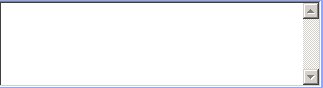
Overview
A Standard text area in HTML is created.
|
|
In Browser
|
|
JSP Code
| <Portlet:EditBox field="fieldLinkedToCCAndCached"
rows="5"/> |
|
|
How they work:
This widget creates a standard text area by setting the rows=""
attrbute to the desired amount. Anything over one will set it. The css
style properties can be set from the various style attributes. If no attributes
are set then a standard editbox will be displayed. The autoTabTo=''
attribute allows a field that you wish to tab to , to be specified.
The trim attribute allows a length to be specified, on leaving
the field the length of the value shall be trimmed. Setting the attribribute
password="true" will change the HTML input type to input="password",
this then creates a standard password field.
|
|
Controlling the look of the Editbox by CSS
The drop down widget's corresponding CSS can be found in 'source/html/jaffa/css/widgets/editbox.css'. This CSS allows you to change these two elements textarea and input.
|
